Diagrammatic Representation of Data
- Data can be represented diagrammatically by pictograms, column graphs, horizontal bar charts, pie
charts, line graphs etc.
- In bar chart, numerical data is represented by bars, which may
be vertical (column graph) or horizontal (in horizontal bar graph). These bars must be of
uniform width and equally spaced. The labels on horizontal and vertical axes should be clear.
- If subcomponents of items are given, then the bars may be subdivided.
- If two or more different values are given for each item, and
comparison between these values is required, then multiple bar charts are better. Here
bars for an item are placed side-by-side.
- In pie charts, the circle is subdivided to show the comparison
between different values. The angle of the sector corresponding to an item is given by
Angle of sector = (Value of item /Sum of values of all items) x 360°
Exercise
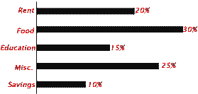
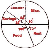
- A family spends its monthly income in the following manner:
Rent 20%, Food 30%, Education 15%, Miscellaneous 25%, Savings 10%.
Represent this data by a
(a) Column graph
(b) horizontal bar chart
(c) pie chart.
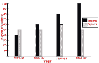
- The following table shows the imports/exports of a country in millions of dollars.
| Year |
1995 -96 |
1996 -97 |
1997 -98 |
1998 -99 |
| Imports |
40 |
60 |
80 |
100 |
| Exports |
50 |
50 |
60 |
50 |
Represent this data by a multiple bar chart.
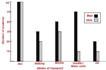
- Given below is the data of college going students:
| Mode of Transport |
Bus |
Walking |
Bicycle |
Scooter/Motor cycle |
Car |
| Number of boys |
60 |
30 |
40 |
50 |
20 |
| Number of girls |
60 |
20 |
30 |
10 |
10 |
Represent this data by a
(a) Column graph, with each bar subdivided to show boys/girls
(b) Multiple bar chart.
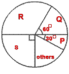
- A total of 12000 soap cakes were sold in a year. Four main
brands were P, Q, R, S. Use following pie chart to find the number of soap cakes sold by
the four main brands.
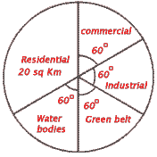
- The following pie chart shows land usage in a metropolis. Represent this data in tabular form.
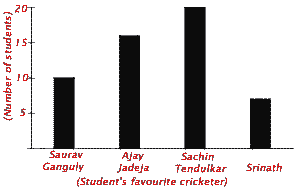
- Make a table corresponding to the following graph:
Answers
1. (a) Column graph showing monthly expenditure of a family.
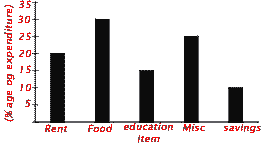
(b) Horizontal bar chart showing monthly expenditure of a family.
(c) Pie chart showing monthly expenditure of a family.
2. Multiple bar chart showing imports/exports of a country
3. (a) Column graph showing various modes of transport taken by college going student
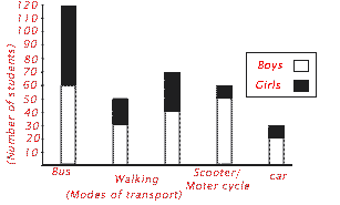
(b) Multiple bar chart showing various modes of transport taken by college going students.
4. P-1000, Q-2000, R-4000, S-3000.
5. Table showing land usage in a metropolis.
| Land usage |
Residential |
Commercial |
Industrial |
Green belt |
Water bodies |
| Area (sq km) |
20 |
10 |
10 |
10 |
10 |
6. Table showing students favourite cricketer
| Criketer |
Saurav Ganguly |
Ajay Jadeja |
Sachin Tendulker |
Srinath |
| Number of students |
10 |
16 |
20 |
7 |